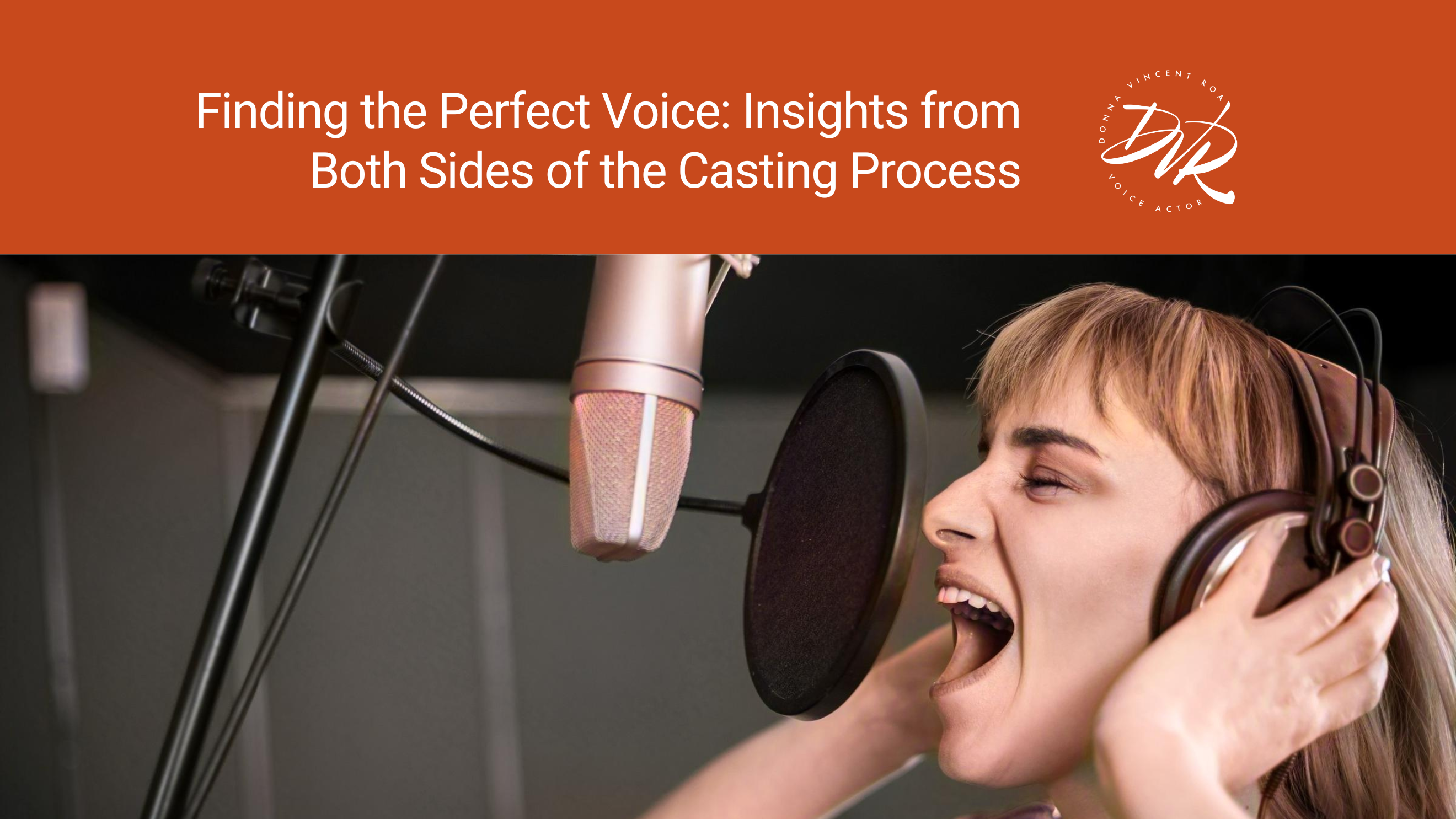
Establish the Right Tone
As a voice actor with extensive professional training in theatre and an international brand expert, I understand the power of visual cues to convey nuanced messages. When creating the design for my professional voice actor website, I knew the color palette would be integral in establishing the right tone.
Colors can convey complex meanings and emotionally resonate with audiences. For my new website promoting my work in the arts, I wanted a palette reflecting my dedication to classical sophistication and contemporary innovation, in addition to attracting discerning clients seeking a voice with depth, intelligence, and versatility.
Conveying Credentials Through Color
As someone who has studied the symbolism of color, the deep blue hue of #04354b spoke to me on an intuitive level. I understand how the pigment of blue has accrued resonances of intelligence, nuance, and professional gravitas. These are attributes any voice actor must convey to satisfy discerning clients.
Beyond its cultural associations, this shade also holds personal significance. I’ve always found blue tones to be calming yet stimulating. Blue promotes clarity of thought and ease of expression – qualities vital to my work inhabiting a range of characters and styles. Scientific research validates what I’ve experienced firsthand.
With blue as my anchor color, I aim to establish the same confidence and trust that prestigious brands and institutions have long conveyed through their associations with blue. It reflects my dedication to nuance, reliability, and sophisticated skill under pressure. Ultimately, my site’s color choices stem from academic understanding and intuitive wisdom gained through my experience as a brand expert guiding international organizations through brand overhauls and updates.
Orange Sparks Creativity While Maintaining Approachability
However, I didn’t want the site to seem too serious or aloof from the fun, imaginative side of the craft. So, I paired the blue with the lively warmth of #c8491c orange. As someone constantly tracking new movements and innovations, I believe in balancing tradition with fresh perspectives. This is where the warm orange #c8491c comes in. Its lively, energetic vibrancy offsets the blue’s gravity. Orange sparks curiosity, adventure, excitement, and passion.
Achieving Visual Balance
Together, these colors achieve balance. A visual equilibrium. The deep blue grounds while bright orange brings levity. It presents a voice that can take on any tone, from scholarly to spirited, depending on the character or copy. Luxury brands demand versatility and polished skill – qualities this harmonious palette reflects. My brand guidelines feature my color palette, secondary elements, typeface, and photos.
Furthermore, research also shows the psychological benefits of using blue and orange in combination. Their contrast stimulates the brain by catching and holding attention. Yet they remain harmonious rather than high-contrast colors, avoiding visual stress or clash. Viewers experience calm focus instead of restlessness or fatigue.
The Right Colors Can Showcase Your Vocal Dynamism
Of course, colors alone don’t define a brand. But as the first impression, they set the tone for the entire experience. My site is modern yet timeless, with #04354b and #c8491c at its core. Scholarly, yet spirited. Erudite, yet inviting. It aims to attract the innovative cultural leaders and change-makers I admire collaborating with. By understanding how colors communicate, a design can bring a vision and values to life.
Color Resonates Primordially
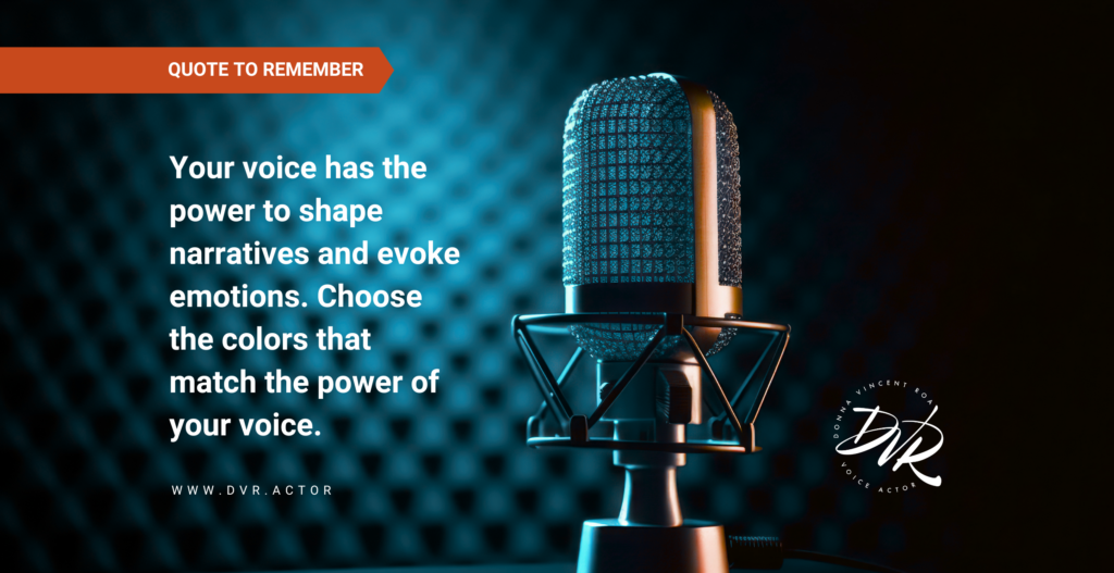
Color resonates primordially, allowing complex concepts to be intuitively grasped. The hues of #04354b and #c8491c speak to both the head and heart in a way that expresses my goals without words. Through their symbolic undertones and psychological impacts, this palette captures what I aim to offer clients – sophistication with versatility and wisdom with dynamism. It presents a voice and brand that can adapt to any brief while maintaining the highest standards of skill, focus, and professionalism.
These tones in the language of color say precisely what I wish my work to convey. What messages do your colors convey?
#SmartVoiceSmartChoice #VoiceActor #KeenArtisticIntuition #SheCanTalkBlog #TheWorldNeedsYourVoice